A shot chart is the single most honest picture you can draw of a scorer. A box score tells you a player went 731-for-1,321; a shot chart tells you where those 1,321 attempts came from, which ones fell, and what the offense is actually built to do. In this tutorial we'll pull a full season of Shai Gilgeous-Alexander's shots straight from the NBA Stats API and plot every one of them on a half-court we draw ourselves — about sixty lines of Python, no proprietary data, no paywall.
What we're building, and what you need
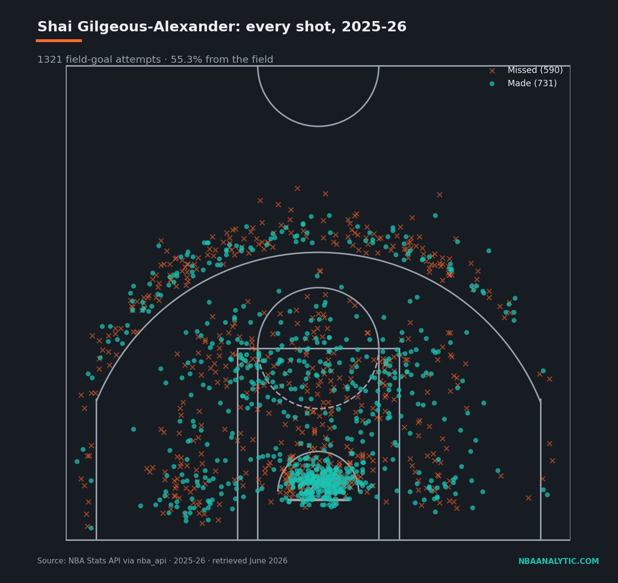
The finished product is the figure below: 1,321 field-goal attempts, made shots as filled circles, misses as x's, sitting on a regulation half-court. Everything comes from one endpoint, ShotChartDetail, which returns one row per shot with an (x, y) location in tenths of a foot. You need three packages: nba_api for the data, pandas to hold it, and matplotlib to draw it.
If you've never made a request against the NBA's stat endpoints before, read getting started with nba_api first — it covers installation and the headers nonsense that trips up every first-timer. Otherwise:
Shellpip install nba_api pandas matplotlibStep 1 — Find the player and pull every shot
The API identifies players by a numeric ID, not a name, so the first move is to look up Shai's ID. The players static module ships a local copy of the league's player list, so this lookup costs no network call. Then we hand that ID to ShotChartDetail. Two parameters matter: team_id=0 means "any team" (use 0 unless you want to filter), and context_measure_simple="FGA" tells the endpoint to return field-goal attempts rather than, say, only made shots.
from nba_api.stats.static import players
from nba_api.stats.endpoints import shotchartdetail

PLAYER_NAME = "Shai Gilgeous-Alexander"
SEASON = "2025-26"

pid = players.find_players_by_full_name(PLAYER_NAME)[0]["id"]

shots = shotchartdetail.ShotChartDetail(
    team_id=0,
    player_id=pid,
    season_nullable=SEASON,
    season_type_all_star="Regular Season",
    context_measure_simple="FGA",
    timeout=30,
).get_data_frames()[0]

# Drop the occasional half-court heave so the plot stays a clean half-court.
shots = shots[shots["LOC_Y"] <= 430]
made = shots[shots["SHOT_MADE_FLAG"] == 1]
miss = shots[shots["SHOT_MADE_FLAG"] == 0]

print(len(shots), "attempts,", len(made), "made")  # 1321 attempts, 731 made
That's it for data acquisition. The columns we care about are LOC_X and LOC_Y (the shot's position) and SHOT_MADE_FLAG (1 or 0). One thing worth internalizing: the hoop sits at the origin (0, 0), x runs left-to-right across the baseline, and y runs out toward half-court. Every coordinate is in tenths of a foot, which is why the numbers in the next step look enormous.
Step 2 — Draw the court
This is the part people expect to be hard and it really isn't — it's just a stack of matplotlib patches placed at the right coordinates. The function below draws a regulation half-court in ShotChartDetail's coordinate space, so our shots will land exactly where they should without any rescaling. The magic constants (radius 7.5 for the hoop, the 475-wide three-point arc, the 80-wide restricted-area arc) are the league's real dimensions expressed in tenths of a foot. Reproduce it faithfully and you can reuse it for any player forever.
from matplotlib.patches import Circle, Rectangle, Arc

def draw_court(ax, color="#9AA3AD", lw=2):
    """Draw an NBA half-court in nba_api coordinate space (tenths of a foot)."""
    ax.add_patch(Circle((0, 0), radius=7.5, lw=lw, color=color, fill=False))           # hoop
    ax.add_patch(Rectangle((-30, -7.5), 60, -1, lw=lw, color=color))                    # backboard
    ax.add_patch(Rectangle((-80, -47.5), 160, 190, lw=lw, color=color, fill=False))     # outer paint
    ax.add_patch(Rectangle((-60, -47.5), 120, 190, lw=lw, color=color, fill=False))     # inner paint
    ax.add_patch(Arc((0, 142.5), 120, 120, theta1=0, theta2=180, lw=lw, color=color))   # FT top
    ax.add_patch(Arc((0, 142.5), 120, 120, theta1=180, theta2=360, lw=lw, color=color, ls="dashed"))
    ax.add_patch(Arc((0, 0), 80, 80, theta1=0, theta2=180, lw=lw, color=color))         # restricted
    ax.add_patch(Rectangle((-220, -47.5), 0, 140, lw=lw, color=color))                  # corner 3 L
    ax.add_patch(Rectangle((220, -47.5), 0, 140, lw=lw, color=color))                   # corner 3 R
    ax.add_patch(Arc((0, 0), 475, 475, theta1=22, theta2=158, lw=lw, color=color))      # 3pt arc
    ax.add_patch(Arc((0, 422.5), 120, 120, theta1=180, theta2=360, lw=lw, color=color)) # center
    ax.add_patch(Rectangle((-250, -47.5), 500, 470, lw=lw, color=color, fill=False))    # bounds
    return ax
If a line ever looks wrong, the fix is almost always a single coordinate. The two corner-three lines are Rectangles with zero width on purpose — a degenerate rectangle is the quickest way to draw a straight segment at a fixed x. The dashed half of the free-throw circle is the part that would be hidden under the paint on a real floor.
Step 3 — Plot made versus missed
Now we layer the shots on top. Two scatter calls do the whole job: misses first (as x's, so makes draw on top of them), makes second (as filled dots). I draw the court before the shots so the lines sit underneath. Set aspect("equal") or every shot will be subtly stretched and the geometry will lie to you.
import matplotlib.pyplot as plt

ORANGE, TEAL = "#FF6B2C", "#19C3B2"

fig, ax = plt.subplots(figsize=(9, 8.5))
draw_court(ax, color="#9AA3AD", lw=1.6)

ax.scatter(miss["LOC_X"], miss["LOC_Y"], marker="x", s=26, linewidths=1.1,
           color=ORANGE, alpha=0.55, label=f"Missed ({len(miss)})")
ax.scatter(made["LOC_X"], made["LOC_Y"], marker="o", s=26,
           color=TEAL, alpha=0.75, edgecolor="none", label=f"Made ({len(made)})")

ax.set_xlim(-250, 250)
ax.set_ylim(-50, 430)
ax.set_aspect("equal")
ax.axis("off")
ax.legend(loc="upper right", fontsize=9)

fg = len(made) / len(shots)
ax.set_title(f"{PLAYER_NAME}: every shot, {SEASON}  —  "
             f"{len(shots)} FGA, {fg * 100:.1f}% FG")

fig.savefig("shot-chart.png", dpi=140, bbox_inches="tight")
Run the script and you get a season on one page: 731 makes, 590 misses, 55.3% from the field. Tweak the colors, the marker sizes, the alpha — but the bones are done.
Reading what we just drew
A picture is nice; numbers are testable. Grouping the same shots by SHOT_ZONE_BASIC (one extra pandas aggregation) turns the chart into a table, and the table is where SGA's profile gets interesting. He took 365 shots in the restricted area and made 71.2% of them — that's the bright knot of teal under the rim. But look at the mid-range: 355 attempts, more than any other zone, at a healthy 54.9% in a league that has spent a decade trying to abolish the shot entirely.
| Zone | FGA | FGM | FG% |
|---|---|---|---|
| Restricted Area | 365 | 260 | 71.2 |
| Mid-Range | 355 | 195 | 54.9 |
| In The Paint (Non-RA) | 303 | 161 | 53.1 |
| Above the Break 3 | 280 | 109 | 38.9 |
| Left Corner 3 | 13 | 4 | 30.8 |
| Right Corner 3 | 5 | 2 | 40.0 |
The corners tell their own little story: 18 attempts combined, all season. Shai simply does not stand in the corner waiting for a kick-out — he is the player creating the kick-out. The shape of this table is what a high-usage on-ball creator looks like: a fat rim total, a mid-range volume that would get most players benched, threes taken off the dribble above the break rather than spotted up in the corner. None of that is visible in "55.3% from the field." All of it is visible here.
Where to take it from here
You now have a reusable draw_court() and a one-endpoint pull, which is the entire toolkit. Swap PLAYER_NAME and you have anyone's chart. From here the obvious next steps are coloring shots by zone instead of make/miss, binning attempts into hexagons to show frequency, or normalizing a zone's percentage against league average to build a true efficiency map. But every one of those is a refinement of the three steps above: get the IDs, draw the floor, scatter the shots. The hard part — which was never actually hard — is done.
Sources & Further Reading
- Theory: Chapter 3: Python Environment Setup — a free chapter at DataField.dev.
- Shot-location data: NBA.com/stats, pulled with the nba_api Python package (2025-26, retrieved June 2026). The full version of this script lives in
scripts/first_shot_chart.py. - Plotting library and patch documentation: matplotlib.org.