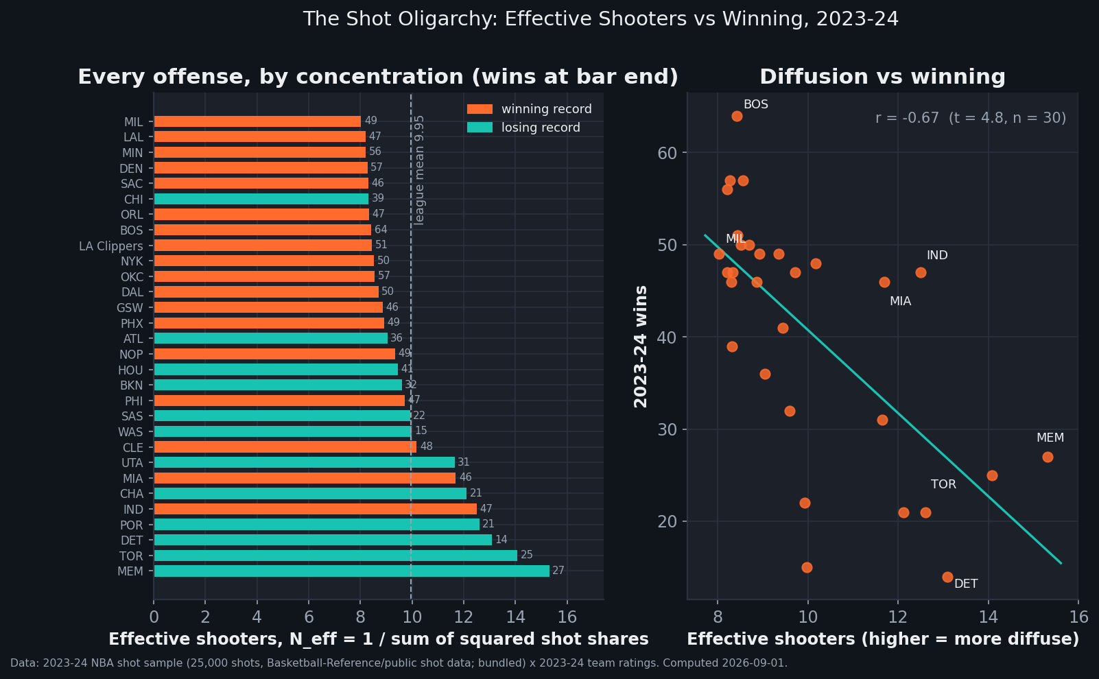
Count the hands that actually run each NBA offense and the league splits open along its standings. Turn every team's 2023-24 shot ledger into an "effective shooter count" — the number of equal-volume shooters that would produce the same concentration — and the thirty offenses run from 8.0 effective shooters in Milwaukee to 15.3 in Memphis. That number correlates with winning at r = −0.67: the eight most concentrated offenses averaged 50.6 wins, the eight most diffuse averaged 29.0. The romantic story about egalitarian, everybody-eats offenses does not survive the table. But before you conclude that force-feeding a star wins games, look at what diffusion actually tracks: how many different bodies cycled through the lineup (r = +0.79). Concentration isn't a scheme. It's what a healthy, settled, honest-about-its-hierarchy roster looks like when you read its shot chart.
Counting the hands
The measurement is one line of arithmetic. Take every shot a team's players attempted in the bundled 25,000-shot sample (773 to 900 per team), compute each player's share of them, square the shares, add them up — that's the Herfindahl index, the same concentration measure economists point at industries — and invert it. The result, Neff = 1 / Σs², answers a plain question: an offense this concentrated is equivalent to how many equal shooters?
Milwaukee, the league's tightest oligarchy, works through end to end: Giannis Antetokounmpo took 170 of the sampled 841 Bucks shots (20.2%), Damian Lillard 165 (19.6%), Bobby Portis 100 (11.9%), Khris Middleton 84 (10.0%), Brook Lopez 73 (8.7%). Square all eighteen shares and sum: 0.1246. Invert: 8.03 effective shooters — two stars, three lieutenants, and a long thin tail. The league mean is 9.95. Memphis, at the other end, spread 851 sampled shots across 32 different names, none above Jaren Jackson Jr.'s 15.6%, for an effective count of 15.31 — nearly twice Milwaukee's.
data_layer/nba_league_shots.csv (25,000 real 2023-24 shots) × data_layer/nba_ratings.csv. Charted and verified by chart_shot_oligarchy.py — 86 asserts.The gradient
The correlation between effective shooter count and wins is −0.668 — with thirty teams that's t = 4.75, not the kind of number a one-season scatter usually hands you. It holds however you slice the concentration: the top-three players' combined share correlates with wins at +0.56, the top shooter's share alone at +0.57, offensive rating at +0.51. Group it and the gap is blunt: the eight most concentrated offenses — Milwaukee, the Lakers, Minnesota, Denver, Sacramento, Chicago, Orlando, Boston — averaged 50.6 wins and a +3.63 net rating; the eight most diffuse averaged 29.0 wins and −5.38. The champion sat comfortably on the concentrated side: Boston ran the league's best offense (124.2, first by three clear points) as its eighth-tightest hierarchy, Jayson Tatum carrying 19.4% of the sampled shots.
Here is the detail that should stop you from reading this as an offensive philosophy: diffusion predicts bad defense too. Effective shooter count correlates with defensive rating at +0.47 — more diffuse, more points allowed — and no shot-distribution scheme has any business explaining the other end of the floor. A dial you turn on offense shouldn't move your defense. A proxy for roster quality and stability moves both. That's the tell.
The churn mechanism
What does the effective shooter count actually measure, then? To a first approximation: attendance. The correlation between a team's Neff and the raw number of different players who appear in its sample is +0.79 — stronger than its correlation with anything in the standings. Golden State and Cleveland got their samples from sixteen shooters each, the league minimum. Memphis's 32 names are what a season of catastrophic injuries looks like in a shot ledger: the rotation never settled, so the shots never concentrated. Toronto (27 names) and Detroit (28) are the teardown version of the same signature — rosters mid-demolition, minutes auctioned nightly. The margin-creep piece watched some of these same teams choose spring over standings at the trade deadline; this is that choice, visible from a different angle. Diffusion isn't a strategy. Mostly it's what's left when the strategy — or the medical report — takes your hierarchy away.
The counterexamples that keep it honest
If concentration were a law, Indiana would break it. The Pacers ran the league's most egalitarian attack by top-man share — Tyrese Haliburton took just 11.9% of the sampled shots, the lowest lead share in basketball — with an effective count of 12.5, deep in teardown territory. They won 47 games with the league's second-best offense (121.9). The difference between Indiana and Memphis is the difference between diffusion as a choice and diffusion as a symptom: Haliburton concentrated the creation and distributed the finishing — the hierarchy lived in the passes, where a shot file can't see it (usage rate has the same blind spot from the other direction). Miami, at 11.7 effective shooters and 46 wins, is the other winning resident of the diffuse tail. And the concentrated eight carry their own asterisk: Chicago's 8.32 came with 39 wins, its top sampled shooter not a franchise star but Coby White — concentration by default, not design.
At the top-share extremes the sample matches the league you watched: the highest single-player share belongs to Jalen Brunson (24.5% of Knicks shots), just ahead of Luka Doncic's 23.3% — and both offenses won 50 games. Across the sample, the shot market's finding still stands: those stars' shots didn't cost their teams efficiency. The market prices a star's shot and a role player's shot the same; the standings, it turns out, price the existence of the star rather more highly.
What this doesn't prove
Four honest limits. First, the causal arrow points backward as much as forward: winning teams are healthier, more settled, and less inclined to auction minutes, all of which concentrates shots. Nothing here says a bad team gets good by force-feeding its best player. Second, this is a 25,000-shot sample — roughly an eighth of the season's attempts. A 20% share carries a sampling error of about ±1.4 points, the effective counts inherit similar noise, and deep-bench players with a handful of season attempts can miss a team's sample entirely — though a seven-shooter spread between Milwaukee and Memphis dwarfs all of it. Third, shots are not possessions: free throws, turnovers and assists are invisible here, which is exactly where Indiana hides its hierarchy. Fourth, one season, with a specific injury map; the shot-diet piece already showed how weakly where teams shoot predicts their rating — this piece's claim is about who, and it should be re-run on another season before anyone quotes the correlations as constants.
Reproduce it
Everything above is arithmetic over two bundled files — the 25,000-shot sample behind the shot market and the season ratings table. The build-side script that draws the exhibit, chart_shot_oligarchy.py, recomputes every number in this article from those two files and pins each with an assert — 86 in all, including the explicit 30-team join check that the Clippers' two names once evaded. If the article and the data diverge, the script fails loudly.
The practical reading cuts against a comfortable narrative. "Everybody eats" describes how good offenses feel; it does not describe how they distribute shots. The teams that won concentrated their attempts in a few settled hands, and the teams that scattered them were mostly broken, rebuilding, or both. When an offense's shot ledger flattens, the question isn't which coach drew that up. It's who got hurt, who got traded, and whether anyone left is worth feeding.